

Trailblazer
Overview
Best Technological Experimentation, George Brown College 2023
Role: UX/UI design, user research, AR development
Tools: Figma, Unity

The challenge: How can we leverage augmented reality (AR) in order to help users navigate unfamiliar environments like campsites and trails?
The problem: How do users engage with AR and how do users engage with “The Great Outdoors“?
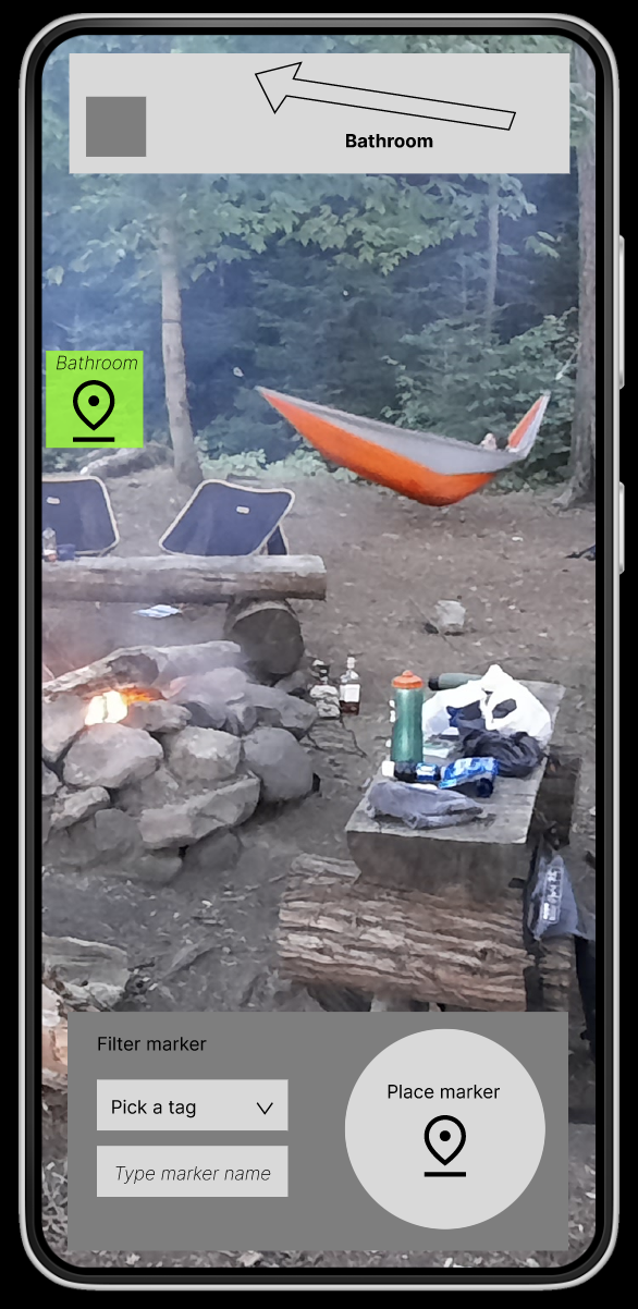
My approach: To build an AR application that allows users to mark locations in augmented reality and find their way back to them.
Concept Video
Research:
Primary research:
I conducted surveys and unstructured interviews, which revealed the following insights:
New campers are unfamiliar with campsites and trails at Provincial Parks
New campers don't feel prepared
There is some interest in AR
Users bring technology with them
Secondary research:
Through a literature review, I found that campers and hikers:
Group campers care mostly about being in nature & connecting with the people they came with.
New media technology does not disconnect people from nature.
Campers are looking for awe and adventure
Ideation:
Initial sketches
These sketches outline my UI, the elements I’ll need for AR app and how my interactions will be programmed in Unity.

Wireframes
I initially designed this app with a more technical style based on a physical orienteering compass. This design includes drop down menus and is text heavy, both of which were not used in my final design.

Unity tests
Figma designs
Initial Figma screens used a compass at the bottom the screen, as well as two different menu types. These elements were revised and changed after conducting user testing.


These tests demonstrate how the app would work in engine. I used unity to develop


User testing:
I did A/B testing on my interface with novice campers in order to see which layout was more usable.


I gave my participants two sets of interfaces to work with and timed how long the tasks took with each button configuration


Finally, I wanted to know what amount of text should be used in the experience


I compared the effectiveness of buttons versus menus


I experimented with the placement of the compass, as well as its size and shape